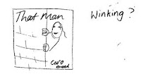
This idea we made but the pose didn't work it looked to static. the background would be cream with a white and blue oval.
these were some sketches we made of ideas like having That man written down the photo of that man, we tried writing Caro in the font she uses but it didn't work out very well. 

 This was an idea of having her sat down but it didn't work as we want her to look like she is having fun.
this cover was inspired by Imelda May from her album love tattoo as she is sat in a dinnor having a milk shake which is very 1950's but we didn't want to copy her album cover.
This is our final design to have a mid shot of caro on the front in the blue and white oval with a off white background. we feel its fun and 1950s style.


No comments:
Post a Comment