Thursday, 8 December 2011

photo shop for the digi pack


1
To create our digi pack we chose to use photo shop as we needed a programme that you could create different layers as we could try different fonts, photos and layout with our losing things we wanted to keep. We also needed to be able to edit photos and text and combines them together and we thought photo shop would be the best programme to use as it does all of that.

I didn’t know anything about photo shop when we started making our digi pack but my skills have improved a lot I have learnt how to use layers how to crop,  use a filter and cut around a photo. I have also learnt short cuts like holding down ctrl brings up the pipette so I can change colour to edit the photo with out changing my brush.


2
I am pleased with our digi pack so far I think it links well with our video and we have though about what images look best and I think the font and images follow our strong 50’s theme though out this project. we have also followed the conventions of a digi pack, like having the title of the album big a cross the top of the album cover, having a photo of the lead singer on the fount and having a part where the artist writes who they thank for the success of the album.


3


These three photos are where we have tried different fonts from Dafont.com. we wanted to find a 50's style font to carry on our strong 50's and 40's style theme thought out video and digi pack. We have chosen the font on number 3 as we liked it best as it felt more 50's than the other two fonts. the font is called Sailor Larry.


All the photos we cut around to get rid of the back ground so it would only be the photo of Caro (Ashley) on our digi pack. the top left we put two different filters on the photos to try and re-create the effect imelda may has on her ablum cover pic needed.! as her album has a really nice 50's look to it. we used less bright colours to give it a more vintage look to it.


Friday, 2 December 2011

designs for digipak

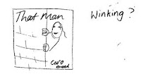
This was one of our ideas to have Caro poking out from behind a wall having her winking we felt this was fun and cheeky her hiding behind a wall also worked at she hids behind trees in the video there for linking the two together. But we didn't feel it was very 1950's inspired.

This idea we made but the pose didn't work it looked to static. the background would be cream with a white and blue oval.


these were some sketches we made of ideas like having That man written down the photo of that man, we tried writing Caro in the font she uses but it didn't work out very well.  

 This was an idea of having her sat down but it didn't work as we want her to look like she is having fun.

this cover was inspired by Imelda May from her album love tattoo as she is sat in a dinnor having a milk shake which is very 1950's but we didn't want to copy her album cover.

This is our final design to have a mid shot of caro on the front in the blue and white oval with a off white background. we feel its fun and 1950s style.