Wednesday, 25 January 2012

programmes we used

we gathered this icon images together these are all the different programmes we have used though out this project. some of them on a Mac some on a PC. 


vevo
youtube
google street view
t-mobile
photo shop
i tunes
i movie
neo office
e-mail
safri 
power point
handbreak 
facebook
pages
blogger
i photos
excel

here are the cameras we used to film and take photos with thought out this project. 


Friday, 13 January 2012

trying out different magazine adverts

This is the photo we chose for our magazine advert, we also wanted to use the same font (sailor larry) to link the digipak and advert together. We also have the digipak on the advert so people know what the digipak looks like for when they want to buy it and this links the two together very ofusly people will know what the what need to buy by looking at our advert.
we chose this photo of "caro" as it was fun and it looks like she is holding the digi pack. We thought out different images but we thought this one worked the best for our avert.


we werent sure which colour to use for the back ground though. we tried red first as "caro" is wearing red accessories and we have red font on the digipak and in the music video "caro" has a red dress. so red would link all of those. its also a happy colour. However it takes away from the photo of "caro" and the digipak as the red is so eye catching and bright.


Next we tried the cream colour on the font of our digipak which would link the digipak and advert. The cream dosent take away from our photo but it dose mean we cant see the digipak as it blends into the background.


Then we tried the blue which was on the oval on the digipack which would link the digipak and advert. The blue also doesnt takeaway from out photo of "Caro" or our digipack. which is why we chose this blue for our magazine advert.

Wednesday, 11 January 2012

finished digipak

This is our finished digipak ... (the light blue lines wont be there they are just markers.)


The top left it an LP, as that is where our C.D will go but in the 1950's they had LPs so we thought we should use an LP on our digipak.
The top right is where we have written our thanks, we wont it to people we (me and heather) need to thank (every one who has helped us with our music video). we chose a 50's font to write it in to carry on our 1950s theme. at the bottom we have our ...... we digipaks have on them, we needed to follow that convention to make our digipak look professional. We used that photo as it the last part of our music video before it fades to black so it links the video to the music video.
Bottom left our back cover. we used the same font as the "thanks" as we didn't want to use loads of different fonts and we liked the font to write the songs list as that is a convention of digipaks to have the song list on the back. We put grand mono as that is where Caro Emerald records her songs ? and she has it on her album covers. We also put the price, bar code and the fact its a C.D on the back as all digipaks have this so we needed to have it as well. We chose that photo as we liked the photo it just didn't work on the font so we tried it on the back and really liked it.
Bottom right our font cover we are really please with this we have a 50's font for that man the same font  to write Caro Emerald as Carp Emerald uses. we are pleased with the photo its fun and show caro as we want her to be seen strong but also very pretty. over all i am very pleased with our digipak i feel it looks good and links to our music video and our 50's theme.

designs for poster

 This was our first idea a collage of different 40's and 50's item like, the milk shake and the 50's eye make-up we tried it out but it didn't work how we wanted. There are photos of how it turned out.

we used screen shots of footage and took some photos for this collage.

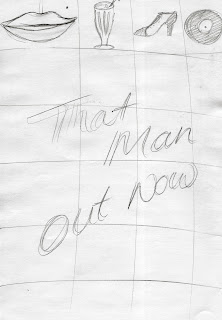
we had two ideas of how to do this first one was randomly have the images which had a nice hand made quality to it and to have boxes which had more order to it and it was kind of like a dinnor floor with the checks. but we used blue and red and white, and blue and white  pocka dots for our squares. this was because they were the costumes we used in our video.

we tried out the first idea of not having the pictures in order. there are some photo of it below, we tried having the photos in black and white and in a vintage tone. We also tried different fonts on them, we chose 50's fonts we used sailor larry which is what we used on our digipak as that would link our digipak and advert together nicely and after looking at existing adverts, they often have the same font as the album cover.

It was difficult to find images which went together and I don't feel it looks very good.


 we didn't like it because it just looked like a professional magazine advert. so we went on to think of new ideas.


This was our next idea ... not very well drawn. coldplay had there album cover but digger for there magazine advert so we thought of maybe doing this. it would link the two together well but we felt it might be a big boring.


Idea 2 was to use this image

which is at the end of our music video and on our digipack so would link very well. The rest of the poster would be black. but we didn't feel this had the 50's theme and it was also quite boring.


idea 3 we liked this one. A photo of "our" caro
holding the digipak we felt this was fun and linked the digipak and album cover well as the digipak is on the magazine advert.


magazine adverts

we looked in Q and ... magazine to find some adverts that artists have got to advertise them new album as we are going to make one for our album.


This is Coldpays magazine advert for there latest album this advert is a bigger version of there album cover. which is something we could do for our magazine advert.

They have used the same font on the advert as they have on the album cover. they have also Written when that its out now, so we will need to write when its coming out on our advert.

However I find this advert quite play and boring I would want our advert to be more interesting.

 This is Elvis Presley's magazine advert for is digipak, LP and D.V.D. It's all been linked together but using photo of Elvis from the same photo shoot, he's wearing the same thing in all the photos, the same yellow font with the red bander behind is used on the advert and on all the products they are advertising. This advert also says when is coming out. It also says where you can by it Play.com and Amazon.com and the copy right. I like this advert more than Coldplays as it more interesting to look at the fonts stand out better and there is more to look at.
 I like this advert the photo is really nice, and it doesn't explain its self so it leaves you questioning what its about, which is good because with adverts you want people to remember it and to keep thinking about them so they will hopefully buy the products.
we will want our advert to be remediable.
 I like the idea of having a photo of the album cover on the poster it means people know what they are looking for when they are looking for when they want to buy the album. The point of the advert is to get people to buy our digipak so we need to make people want to buy the digipak but also where they can buy it, when they can buy it and what it looks like so they can buy it.
 I really like this idea of using a lot of different photo to make but the photo, it looks really effective. If we were to do this we could link the poster and music video together well as we could use photos from the music video.


designs for album cover

This was our first design for our digipak. we liked the photo but felt it looked quite boring and we wanted our digipac to be fun like our video is. we liked the font but didnt feel it was very 1950's and we wanted to stick to our 1950's theme. we did like the red for the font though as it carried our 40's theme and it stands out nicely.


we really like this idea because it has a strong 1950's style to it with the colours. But we felt the font wasn't very 1950's and the pose was static and boring so we knew we needed to try different fonts (which we did) and try different photos. the "caro emerald" isn't the same font as she uses on her album cover so we needed to get the same font for our digi pak.


Out of the font we tried out we liked this font best and we felt it was very 50's which is what we wanted. we used photo shop to paint over the "caro" font as we couldn't get it from anywhere. we liked this photo but it doesn't work on with the blue oval the composition is all out and it looks a mess. so we wont be using this photo.


This photo looks a lot better but the colour of it weren't very nice so we tried to using a filter which looked nice but wasn't the look we were going for our digipak so this also wasn't right.


This is the photo we chose for our digipak as it was happy and looks nice with the font and the blue oval behind. we are happy with the font cover of our digipak.


Thursday, 5 January 2012

using photo shop

here we are touching up some of the red on the beads as it had changed colour. we did it with a normal brush tool and my using the colour which was already on the photo so we have the exact match of colour we did this a lot for the hair and skin as the green screen which is where we took the photo tinted the skin and hair slightly green which we didn't want on our photos.  

here we have changed the transparency of the photo, as we need the writing for the "thanks" to be seen easily. 


The same font is used to write Caro Emerald on all of her album covers so we wanted to follow this but we couldn't find the font she uses so we downloaded a photo of the font and painted over it in photo shop and we saved our painting as a different layer so we could then use it on our album cover.
 This is when we had just starting writing with just our layer.